Project Description
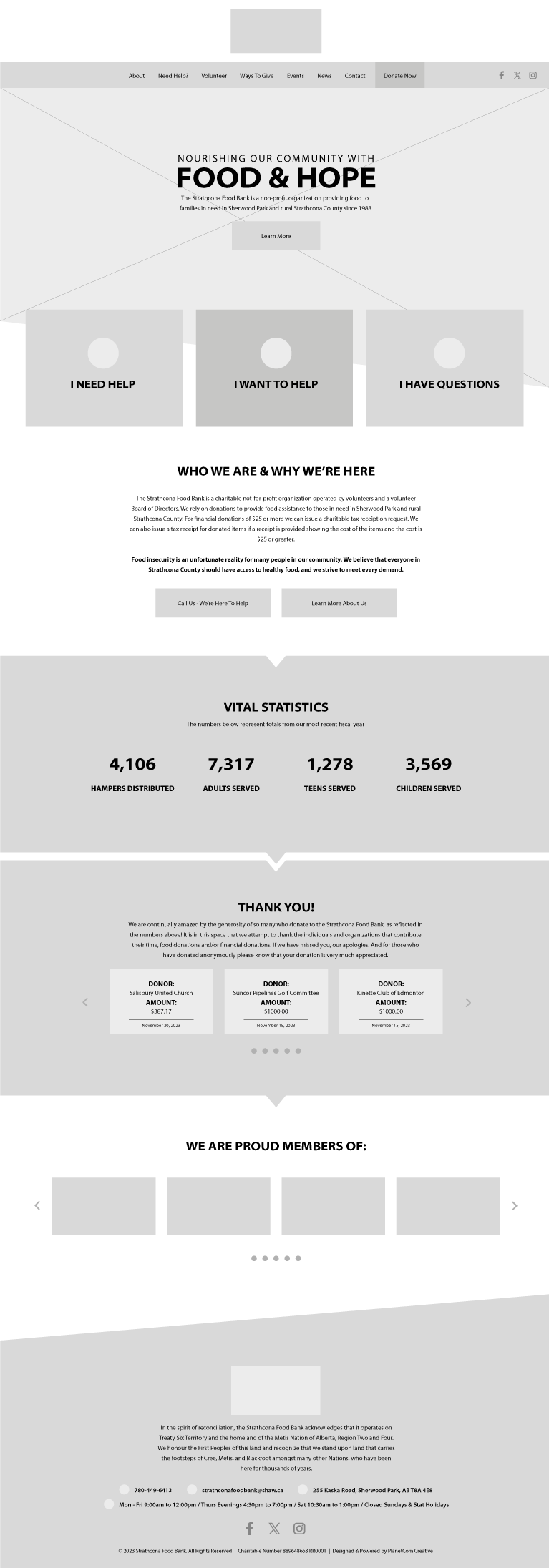
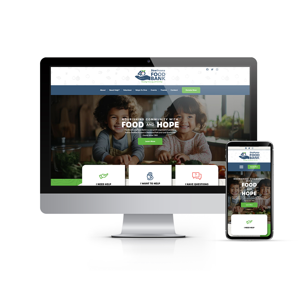
Was excited to have the opportunity to completely redesign the website for the Strathcona Food Bank. Projects for non-profit organizations are always fun & fulfilling and present some unique challenges, especially for ones that are well established and play a vital role in the community (no pressure at all)... and this was no exception!
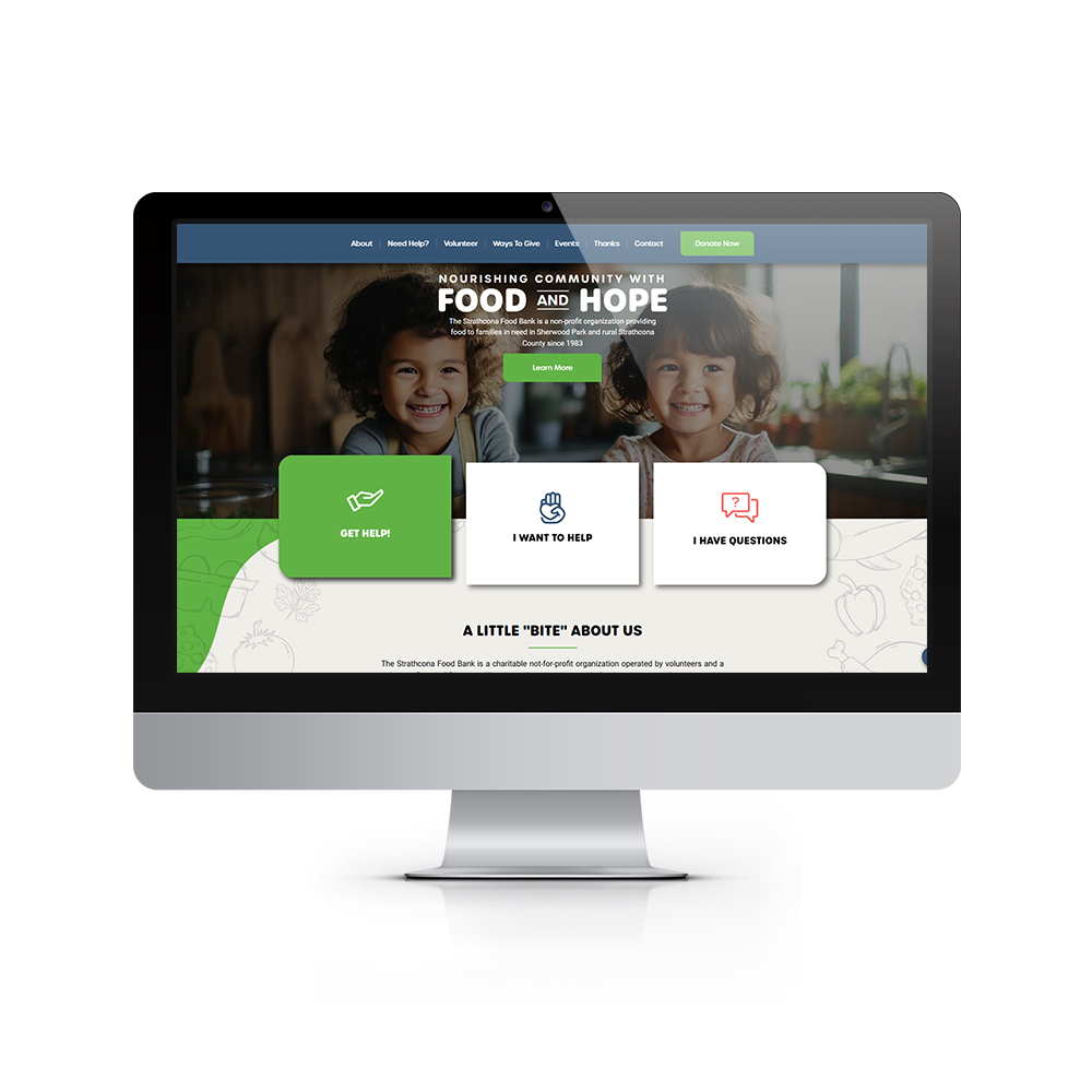
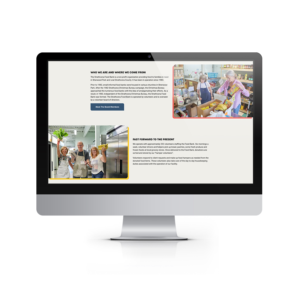
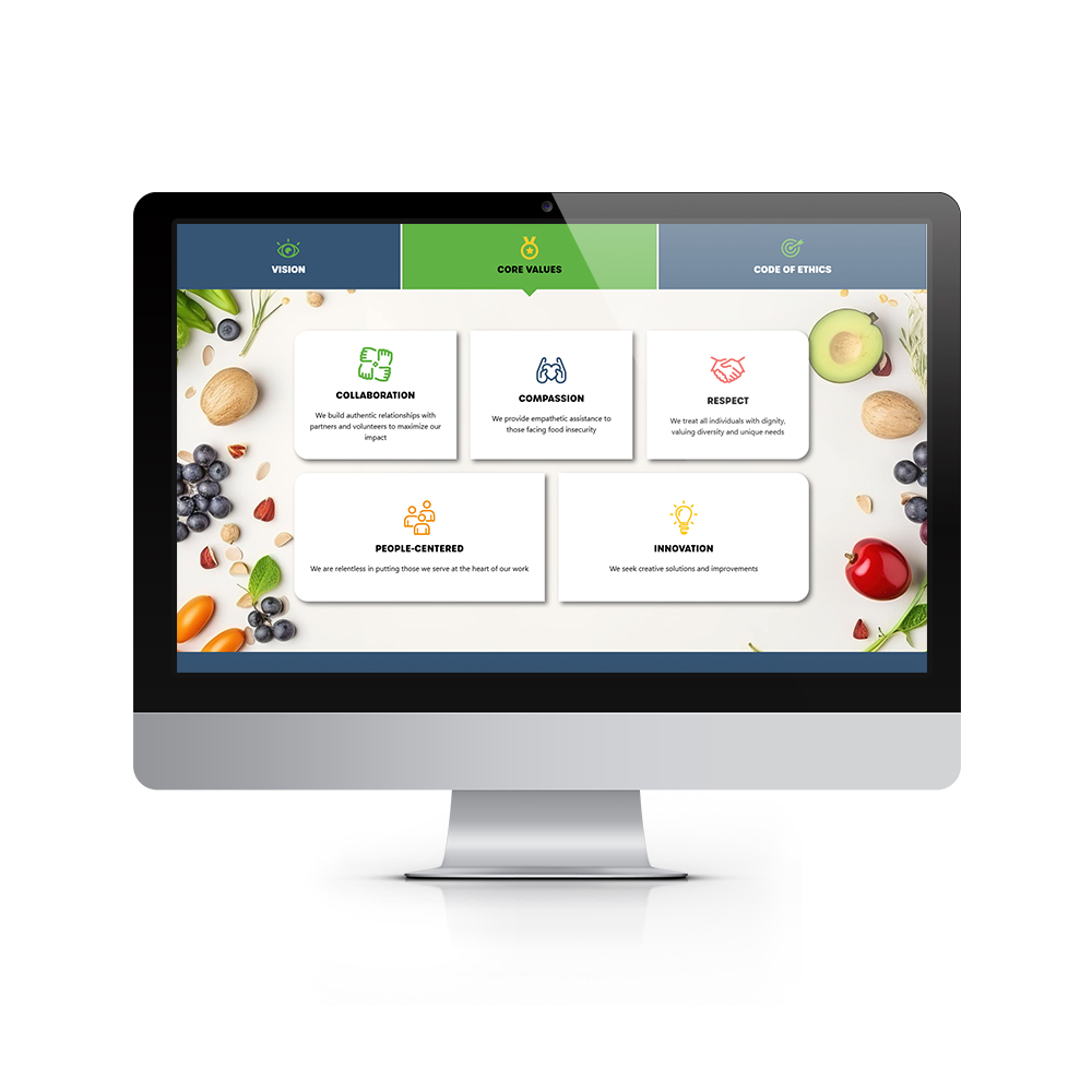
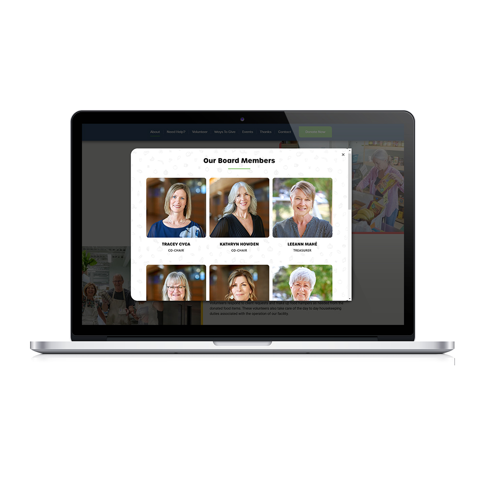
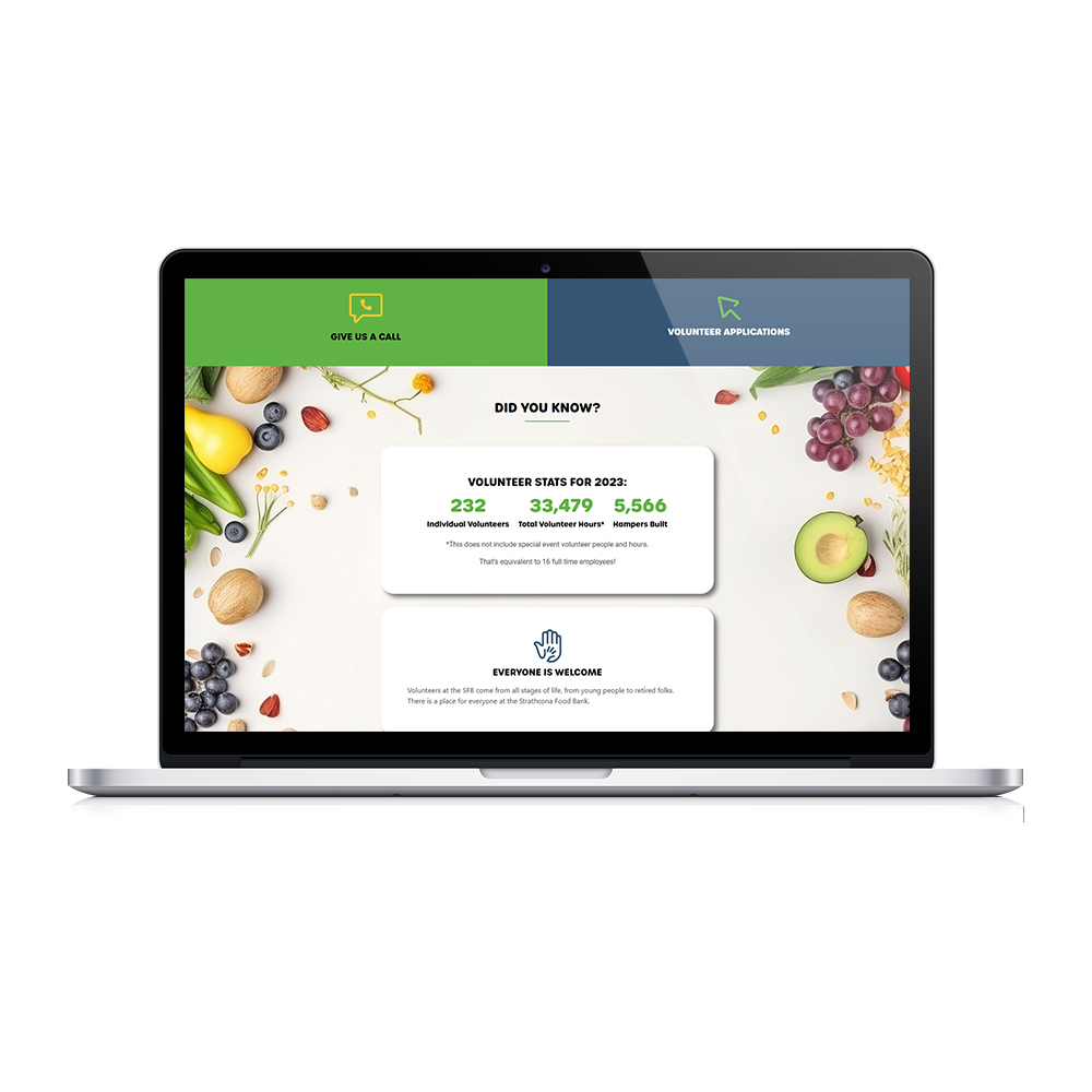
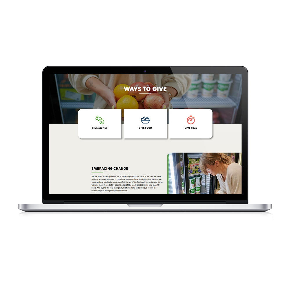
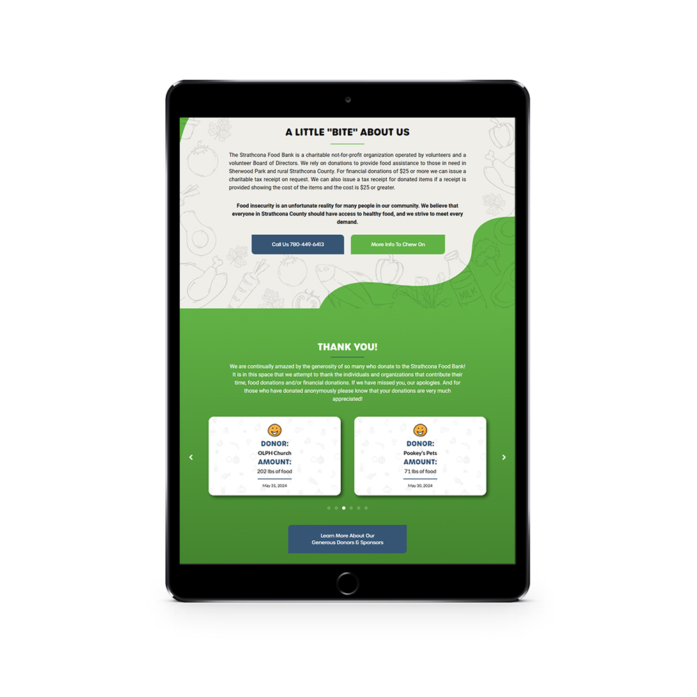
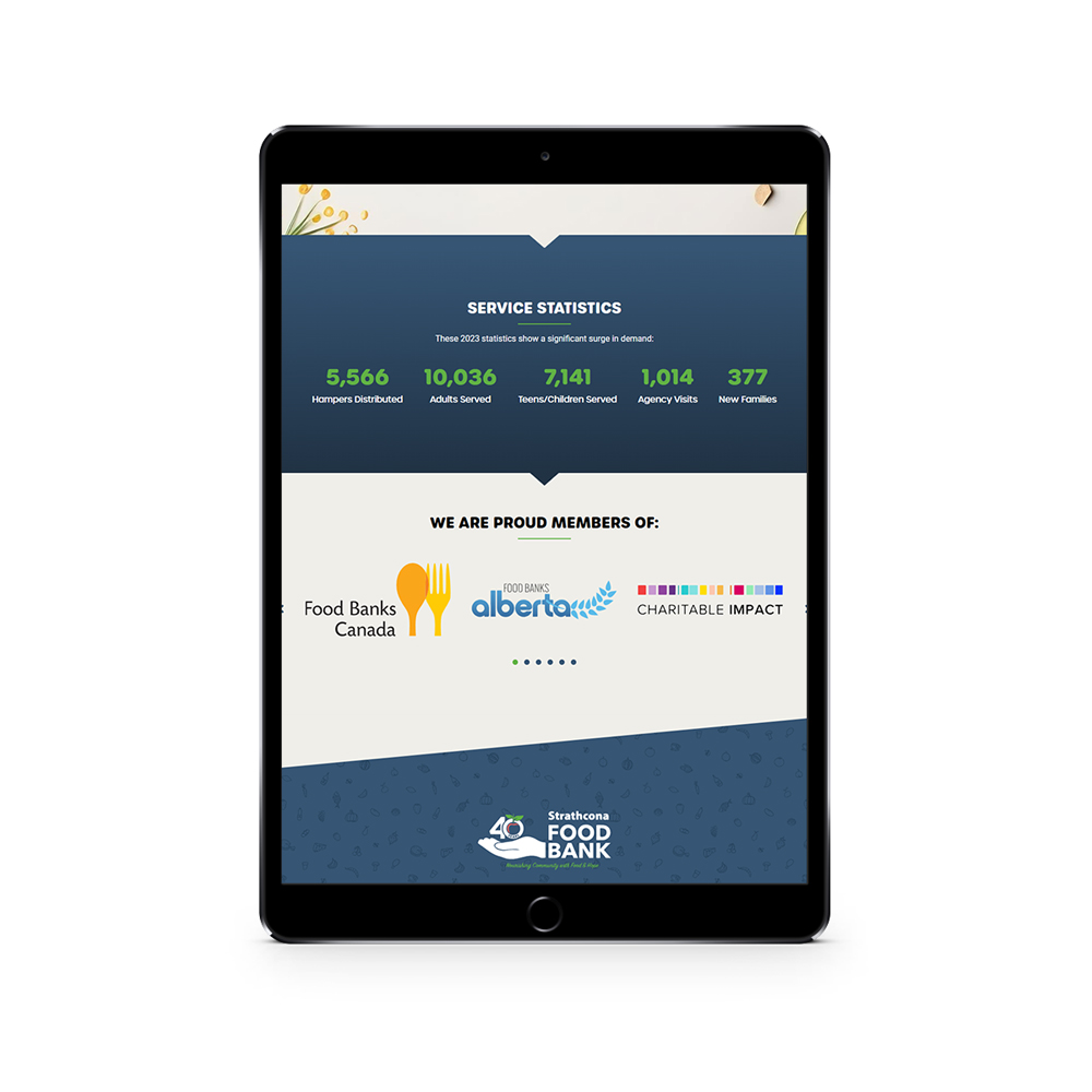
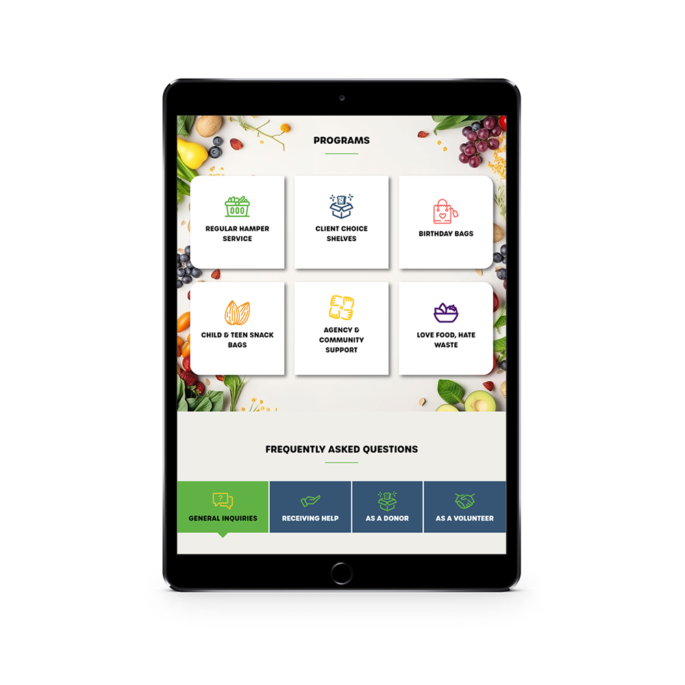
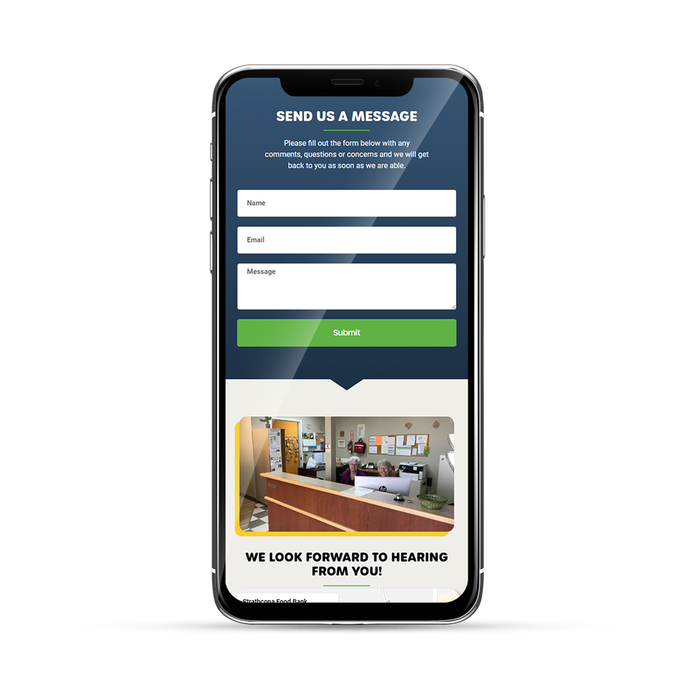
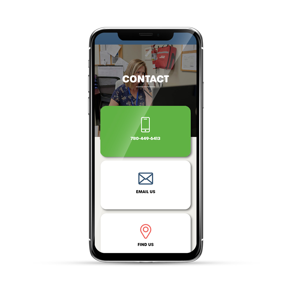
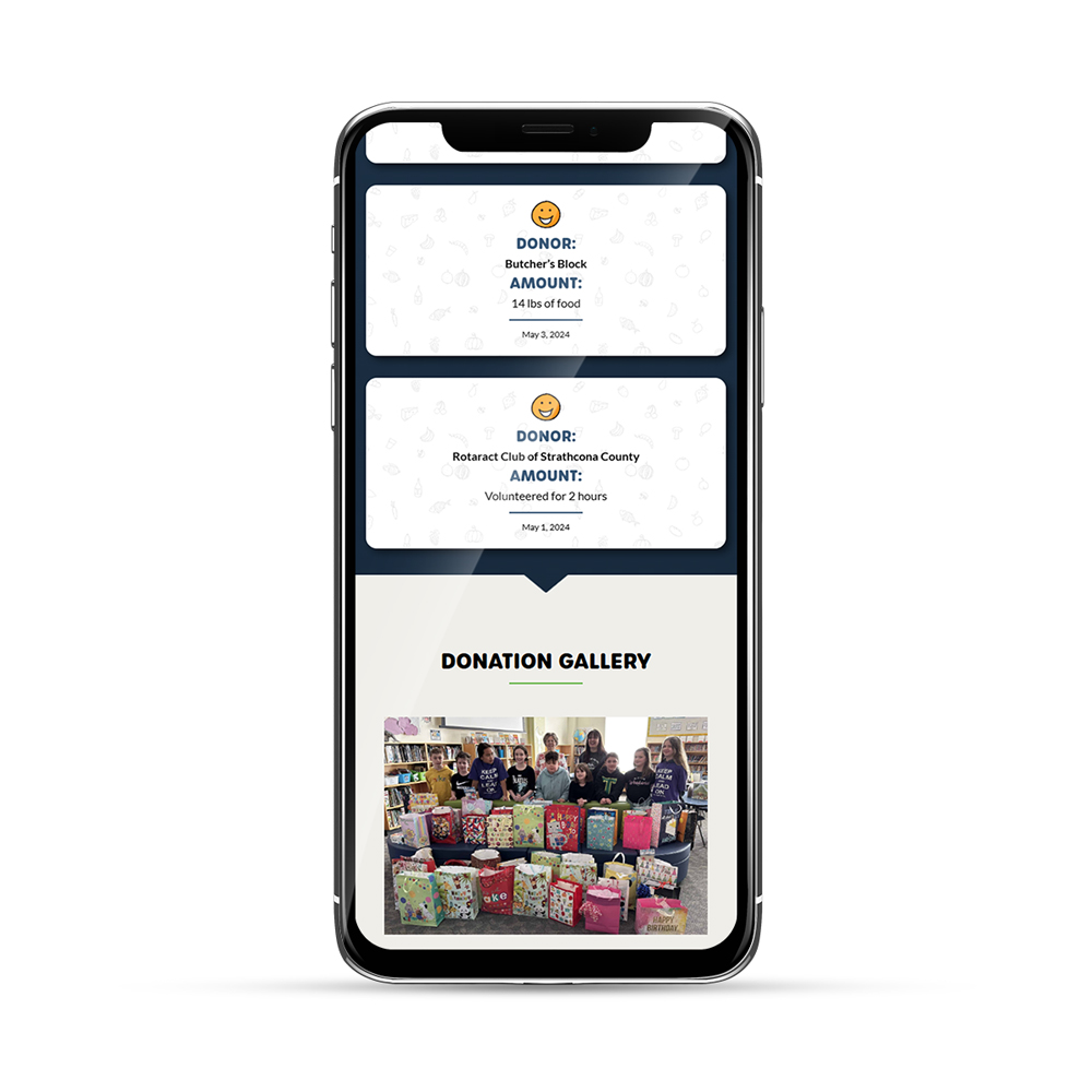
Websites like this have a lot of moving parts and special requirements, so the biggest challenge was to reimagine it in a way that was both visually pleasing/engaging and functional/practical for the wide range of users who depend on their services. I believe the final product achieves these goals while maintaining an inviting & inclusive experience and friendly, approachable aesthetic. Pops of bright colour in conjunction with simple, clean icons & graphic elements are used to highlight and navigate the user to important & useful information throughout the site. Modern interactive elements such as animated stat counters, revolving carousels, popups, and well-organized tabbed content & accordions help to present an otherwise overwhelming amount of content in an intuitive, easy-to-read manner, all while elevating the overall user experience.
Tools Used


