Project Description
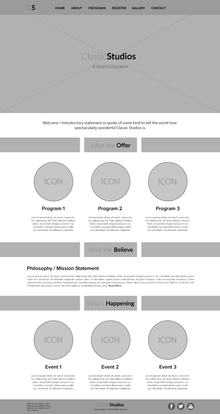
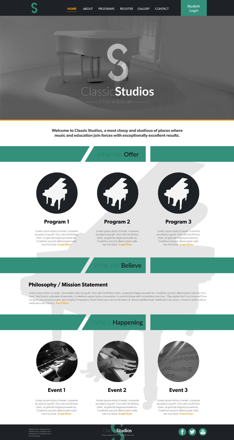
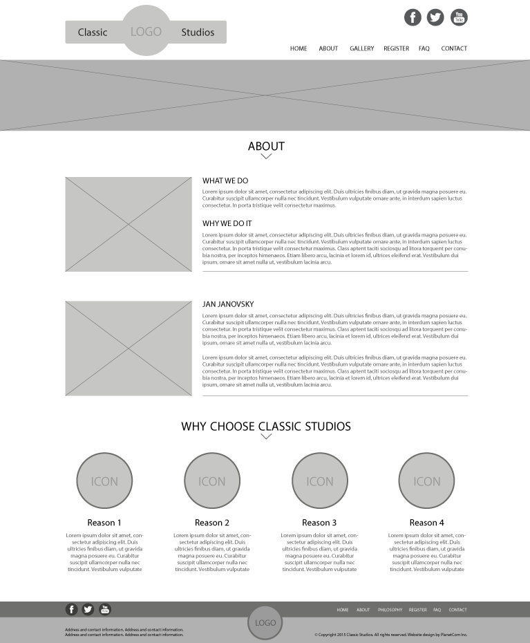
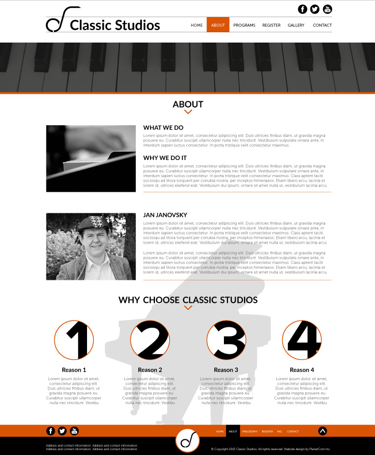
This PlanetCom project was a fun challenge involving the design, development and branding of a modern, responsive website for Classic Studios, an innovative music studio in Sherwood Park. I particularly enjoyed working on this one, as it managed to seamlessly combine my love of music, design, and creativity. The website you see now is a complete redesign that was launched earlier this year, and was the first time I've gotten the opportunity to redesign a site that I had originally designed in the first place!
The overall look and feel of the site is clean and modern with concise, well written content that conveys the client's quirky sense of humor. The colour scheme used is contrasting yet complimenting orange and blue as the highlights and clean and classy black and white balancing things out. The typography was carefully chosen to match the themes present in the visual and written content of the site, with a fun yet readable script font for the logo and select headings, and a clean sans serif for everything else.
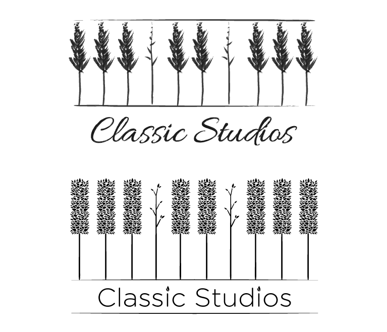
The project also included some branding work for the logo, which was derived from the client's vision of taking the popular phrase "Can't see the forest for the trees" and modifying it slightly to fit the context of a piano studio, which turned it into "Can't see the forest for the keys".
Tools Used


