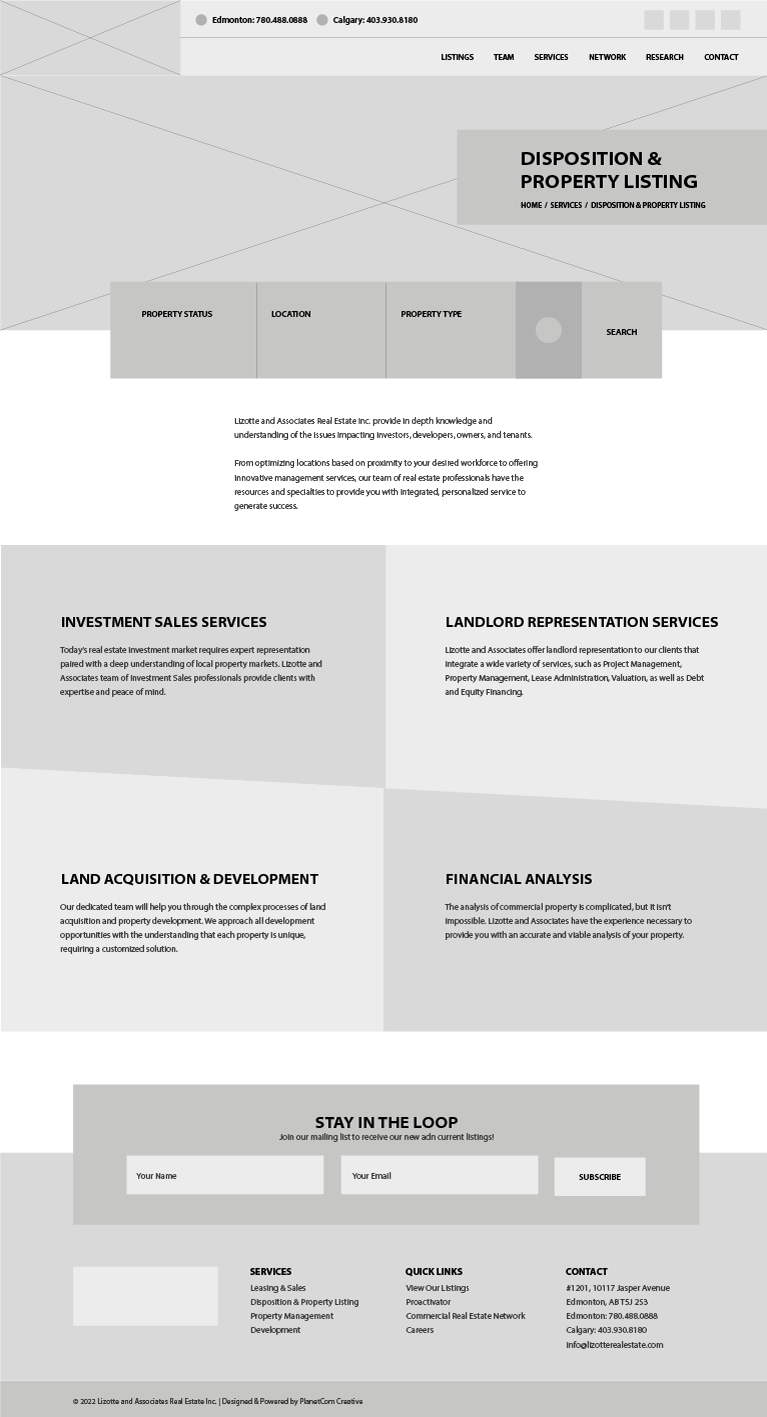
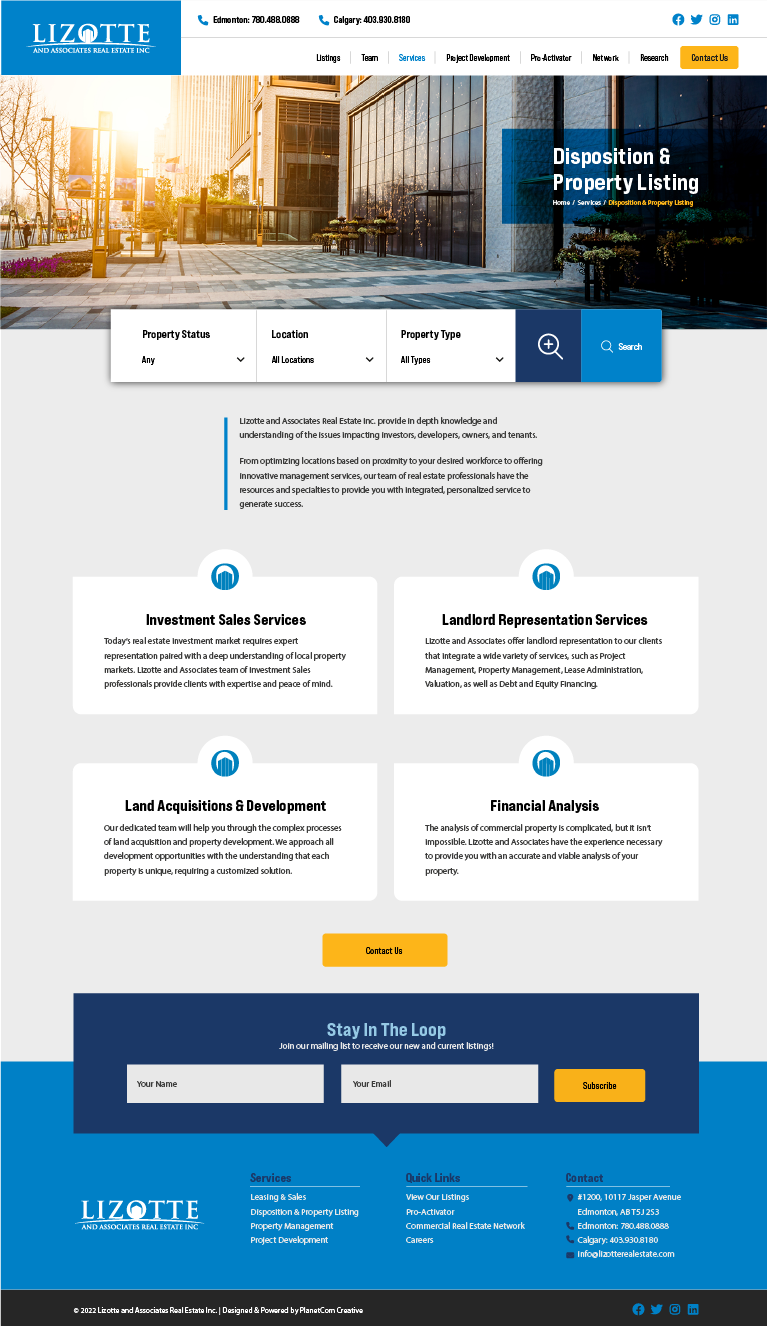
Project Description
This project saw me diving head first into some new territory, being the first real estate website I've ever been in charge of designing and building. A bit overwhelming at times for sure, but the opportunity to learn, be challenged, and expand/extend my skillset was absolutely welcomed.
Having well established branding guidelines, colours, and a detailed (and quite lengthy) list of needs & wants direct from the client meant my work was cut out for me right from the get-go. I also got a lot of help on the technical side of things, primarily the importing of all previous property listings from their old website to the new one, so I was able to focus all of my creative energies on the design, layout, and functionality of the site. Taking inspiration from other leaders in the commercial real estate industry but always striving to be unique and set apart from the competition, I believe the end results speak for themselves and give both the client and end user a much more modern, meaningful, smooth, and seamless online experience.
Tools Used


